Spring 2024 Color Trend Analysis: Three Ways to Style Your Glasses Using the Season's Trending Colors

As we step into Spring, there are some clear trends coming off fashion runways that I think you should know about. From new neutrals and bold, rich colors to unique textures and patterns, this season is all about defining your statement through your style.
You may be wondering why I’d cover fashion runways when my niche is eyewear and eyestyle. For the simple reason that you don’t wear glasses naked! There is definitely overlap in fashion and eyestyle.
If you think about how you dress yourself in the morning, you may think about the outfit first, then which accessories to pair it with. The days of wearing one pair of glasses with everything you own are over!
There’s just so much choice and variety these days, why would you relegate yourself to one color, size, or shape. It’s not like when I started out, there was, what I call, a "sea of sameness". My choices were sexy librarian in brown, black, or grey. Now anyone can be their own Gaugin, Picasso or Mondrian using your creativity, courage, and inspiration.
Let's take a look at the color trends that graced the runway of top designers. We’ll look at three ways you can style each trend with glasses, and/or sunglasses.
FRESH WHITE

Spring is the perfect season to embrace fresh and clean looks. One of the standout trends this year is the crisp white dress. A little white dress is a Spring time perennial, however, the difference this season is in the materials used and the how they’re being styled.

Delicate see-through materials in various levels of transparency are forecasted to be everywhere this season. Think lace, embroidery, and chiffon, all these materials provide natural airflow so you catch every breeze as the weather warms.
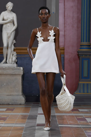
Statement belts have become another trend in paring your white dress. They say what goes around come back around. The statement belt is back from the 70's and 80's. They’re a versatile accessory that adds a pop of personality and style. Whether embellished with bold buckles, unique textures, or vibrant colors, statement belts are a fashionable way to cinch that waist and make a statement.


The idea is to use your accessories to draw attention where you want it. Let’s look at how we can style your glasses with these trends using a monochromatic, contrast or color blocking approach.
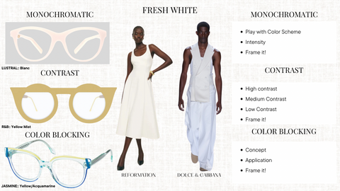
MONOCHROMATIC = “mono” one, only, single; “chrome” color
- Play with intensity. Sometimes being swathed in one color can come off as flat or one-dimensional, to avoid that, play with intensity. Pair your outfit with glasses that are more or less saturated in the same color. For example, pair your all white outfit with a clear frame, or a transparent white frame to dial down the intensity.
Frame it ! : The “Lustral” shown above is an opaque white. It gives your face and the outfit a more intense effect.

CONTRAST = pairing colors of different hues, tones, intensities, temperatures and values
- For high contrast, pair with dark colored glasses i.e black, navy, forest green, brown
- For medium contrast, pair with bold colored glasses like fuschia, orange, red,
- For low contrast, pair with a soft pastel
Frame it ! : The soft yellow in our “R&B” frame gives a soft contrast to any white ensemble

COLOR BLOCKING = colors from opposite sides of the color wheel are paired to form complementary combinations
The concept originated with the artworks of Piet Mondrian, the Dutch painter.
- Color blocking white is easy, pair it with a multicolor frame. Bold to subdued, it’s your choice
Frame it ! : I went with “Jasmine” because it gave me Spring vibes. The yellow and greenish-blue brush strokes against a clear frame gave color and levity.


Butter yellow has emerged as a strong trend this spring, capturing the essence of renewal and optimism that the season brings. Also called pastel yellow, or mellow yellow, it’s between cream and beige. It’s been gracing runways since Autumn 2023, it seems the trend is getting stronger.


The possibilities are only limited by your imagination.

Let’s look at three ways I would pair butter yellow with glasses.

MONOCHROMATIC
- Go Metallic: If you’d rather not repeat yellow in your eyeglass frame, consider a metallic frame. The shimmering richness of metallic gold blended with yellow creates softness and luxury.
- Frame it ! : The “Norrebro” pictured above is a modern take on the classic round frame. The matte gold gives a subtle nuance to the pale yellow. Ideal for oval and angular faces.

CONTRAST
- Tint, Shade, Tone can be used to add contrast to a color while staying in the same color family
- Tint is the mixture of a color with white, which increases lightness
- Shade is the mixture of a color with black, which increases darkness
- Tone is the mixture of color with grey, which reduces its intensity
- Frame it ! : How does this apply when styling a frame? The “Alexandre” frame is a shaded version of butter yellow. It’s yellowish green color is in the same color family and black was mixed in to create this color. Pairing it with butter yellow adds depth and intensity making it a focal point.

COLOR BLOCKING
- Patterns and finishes are another way to color block
- Frame it ! : The “Nathalie Bacterio” includes several elements; the yellow circles have a satin finish; the black and white edges form a bacteria pattern, and the blue bridge adds an accent color. The divergent pieces come together to make a complimentary combination. Voila!


The rise of pale blue as a hot fashion color this season reflects a broader trend towards softer, more soothing colors in the fashion industry. As people seek comfort and positivity in their lives amidst challenging times, colors that convey a sense of peace and optimism become more appealing.

"We found that pastels—such as lilac, butter yellow, and glacial blue—led [spring 2024's] color levels to replace dopamine brights...". "Powdered blues will prevail due to their gender-inclusive and trans-seasonal appeal”. The color “speaks to shoppers' desire for soft optimism in times of uncertainty and desire for comfort through nostalgia".
- Urangoo Samba, Head of Color at WGSN, a trend forecasting company.
For a clean fresh look pair pale blue clothing with neutral tones like white, beige, or grey.


Accessorize it with shades of coral, mint green, or lavender to complement the soft hue. Think pocket squares, ties and socks for men, and hair accessories, pocket books and shoes for ladies.


From ethereal dresses and crisp shirts to sleek accessories and footwear, pale blue is being celebrated.


Let’s look at a few ways you can pair your eyewear.

MONOCHROMATIC
- It’s all in the details! Details may not be immediately obvious to the casual observer, however, they cumulatively create a point of interest.
-
Frame it ! : The “Charles II” frame is a perfect example of details making the difference. The crystal frame is etched with glacial blue enamel in a graphic design. Choosing glasses with details like etching, cutouts, and 3D element, when done tastefully, add a sense of discerning style that can be appreciated by both the wearer and observer.

CONTRAST
- For a clean, refreshed look, pair with white, beige, or grey eyeglass or sunglasses
- To enhance pale blue pair it with shades of coral, mint green, or lavender
- Frame it ! : For high contrast I went with “Piero”. The upper two-thirds feature a dark havana color, while the lower third is ultramarine blue, providing definition and grounding the overall style.

COLOR BLOCKING
- Spice up your pale blue ensemble by mixing it with jewel tones or warm tone
- Frame it ! : I chose “Queen” for the jewel tones combination. You could easily swap for a frame that includes fuschia, red, or orange.


Pantone announced Peach Fuzz as Color of the Year this year. Reminiscent of the soft outer skin of a peach, it emits an aura of comfort and the promise of sunny days to come. Its soothing yet energetic tone bridges the gap between the playful and the sophisticated, enabling a wide range of creative expressions in clothing and eyewear.

“In seeking a hue that echoes our innate yearning for closeness and connection, we chose a color radiant with warmth and modern elegance. A shade that ... effortlessly bridges the youthful with the timeless.”
— Leatrice Eiseman, Executive Director, Pantone Color Institute
- Start with accessories, if you’re unsure about how to incorporate Peach Fuzz into your wardrobe. Ladies, think about your jewelry, handbags and shoes; gentlemen think about your socks and belts. Use it as an accent color.


- Pair it with neutrals. Combine Peach Fuzz with creams, tans, and beiges for a soft contrast look. You can even pair it with butter yellow if you’re feeling confident.

- Pair it with white. A peach jacket over a crisp white dress or trousers makes both colors pop.

- Contrast with jewel tones or denim. For a more subdued yet elegant combination, consider pairing Peach Fuzz with navy, burgundy, or emerald green. Denim in dark to light washes also works very well.

Now, for the eyewear...

MONOCHROMATIC
- Facial Proportions: When choosing frames, take into account not just the color but also the shape and size in relation to your face. Ensure that the frame complements your face shape and fits well with your facial proportions.
- Frame it ! : The “Prozac” with its peachy tones is a match. Men, please don’t think soft colors are exclusively for women. Dwayne “The Rock” Johnson just wore a peach tuxedo to this year’s Oscars.

CONTRAST
- Tortoise shell : The medium contrast of this tortoiseshell design, with flecks of yellow and orange, complement the pastel tone. The bold cat-eye style adds a fashion-forward touch to a soft shade.
-
Frame it ! : I tell my styling clients when they choose conventional colors, be open to unconventional shapes. Tortoise shell is as classic as the day is long, however this geo/cat-eye frame takes the eye style up a few levels.

COLOR BLOCKING
- Gradient frames are on trend this season. Typically color blocked frames have distinct color boundaries. With gradient frames the color lines blend into each other.
- Frame it ! : The "Queen" is a great example in that its the color transitions blend without distinct lines. To style them with peach fuzz, select vibrant or muted color palettes that complement the base color.


Burgundy has emerged as a surprising color trend for this spring's fashion lineup. Typically associated with fall and winter collections, it’s often worn as an alternative to black and brown. Burgundy is now being reimagined in lighter fabrics and silhouettes, making it a versatile and striking choice for spring. Designers are incorporating this bold color into everything from casual daywear to evening elegance, proving that burgundy can bloom in the warmer months.

- Pair it with softer tones and lighter materials, to bring a fresh perspective to your spring fashion. The unexpected appearance of burgundy this season not only challenges traditional color norms but also adds a layer of depth and richness to your usual spring color palette.

- Accessorize it. In my research I found burgundy being used to offset all black ensembles during the bridge period (that time when the weather still hasn’t fully transitioned to spring). Imagine your all black outfit (as a New Yorker black is basically my uniform) paired with burgundy shoes, or handbag. It’s being forecasted that burgundy is going to be a hot color in accessories in particular.
 ´
´

Let’s see how it’s being used and styled with eyewear.

MONOCHROMATIC
- Proportions and Texture: Burgundy is such a sumptuous color that it can be overpowering as a monochromatic outfit. To avoid that, I recommend playing with proportions and texture. Depending on your ensemble, avoid glasses that are a solid block of color.
- Frame it ! : The “Neukolln” has blocks of color offset by metallic gold in a geometric shape. This combination balances levity, and boldness, so you don’t look like a tube of lipstick. You can also play with texture. If you’re wearing sequins or other light-catching material consider a matte frame or vice versa. Natural materials like wood, leather and stone also make a difference in how the frame color affects the overall look.

CONTRAST
- For low contrast, pair with a black, brown, navy, or forest green eyeglasses
- For medium contrast, pair with teal/turquoise, mustard yellow, burnt orange, or sage green to balance the red tone
- For high contrast, pair with soft pink, heather grey, camel, cream or beige
-
Frame it ! : I paired a soft pink leather frame for high contrast. The pebbly texture of the goat leather added a subtle detail.

COLOR BLOCKING
- When choosing a frame to match your burgundy outfit, select a frame with complementary colors. The important thing is to keep the color palette cohesive yet visually interesting.

In Conclusion
As we wrap up our exploration of Spring 2024 color trends, it's evident that this season is set to be a time of renewal and optimism through warm and soothing colors. From the pristine purity of white to the rich depth of burgundy, our seasonal color palettes are being reset. The resurgence of nature-inspired hues, speaks volumes about our desire for grounding and comfort.
We've journeyed through each color, understanding how to interpret them in our eyewear. I trust you now understand that eyewear is not just a medical device but also an extension of your personality. This season’s color trends along with the several ways we can style each one, give us endless possibilities to adapt them to our personal style . Your imagination is the only limit to your creativity.
If you’d like to expand your eyewear collection to include this season’s colors, I’d love to be a part of your process. Email me at eyewearstyling@kindredbydesign.com.